What is different about this grid system from the others out there?
- No IE support. The death to internet explorer happened on June 15, 2022. Which is good because having to build in IE fallbacks or just simply supporting it out of the box has been holding grid systems back from using the latest CSS advances.
- Pre-defining rows is optional. Most grid systems force you to create a row and even calls the sections inside of it a column. Whereas this grid system allows you to truly use flex and have rows naturally form as the content needs to but for when you need, forcing rows is still available.
- A true gap system. In most grid systems margins are used to fake a gap system. In this grid system the gap CSS property is used, meaning it only creates a space between two elements in the grid and does not add a space when it is against the edge of the grid. Additionally, gaps are able to be controlled at a global level
- Customizable Breakpoints. Most grid systems use a max-width breakpoint system which does not align with most standards, it forces you to add more classes than you would need to and it doesn't allow you to have a section not flexed until a certain size. With this grid system you not only have min-width but also you have control over the breakpoint values to match your site. Like most grid systems by Default though you have 3 breakpoints, "s" for small, "m" for medium and "l" for large but in this one you can add more, for example if you needed an extra large you could add "xl" to your $breakpointsUsedForGrid list and now be able to use "fs-xl-6" to do a 50% at that breakpoint.
- Offsets in both Directions. In other grid systems you can only offset from the left of your element but in Flexspan you can offset from either side. The advantage of this is it allows you to not have to wrap each element in its own row if you want at certain breakpoints for an element to be on its own row without actually visually spanning the whole row.
How to put in on the site
Sites are often complex and end up having multiple styles sheets. Remember you only want 1 set of classes to appear across your own site. So with that in mind we have two files you can pull into your site and an example of the code you can use to pull in those files.
The "flexspan-grid-mixins.scss" if a file you could pull in multiple SCSS partials if need be as repeating mixins in your SCSS files will not add duplicates to the final CSS file like classes do. However be cautious with adding the ":root" CSS and the "flexspan-grid-classes.scss" file multiple times in you SCSS files since these are creating classes it will duplicate those classes and you don't want to accidently overwrite yourself or have a bloated CSS file.
So if you are making a brand new SCSS style sheet you would add the following to your base SCSS partial or layout SCSS partial depending on your SASS Structure conventions.
        // Breakpoint mixin used with the Flexspan Grid System
        @mixin breakpoint($break) {
            @media screen and (min-width: $break) {
                @content;
            }
        }

        // Breakpoints you may use across the site within mixins
        $xxs: 360px;
        $xs: 480px;
        $s: 550px;
        $sm: 600px;
        $m: 768px;
        $ml: 960px;
        $l: 1024px;
        $xl: 1200px;
        $xxl: 1400px;

        // Breakpoints you plan on using with the Flexspan Grid System
        $breakpointsUsedForGrid:
            "s" $s,
            "m" $m,
            "l" $l;

        // CSS Variable
        // NOTE: You can not add SCSS variables to CSS variables, however you can use CSS variables in SCSS mixins
        :root {
            --fs-spacing-col: 15px;
            --fs-spacing-row: 15px;
        }

        // Importing the mixings for the Flexspan Grid System
        @import "_flexspan-grid-mixins", "_flexspan-grid-classes";
Based on 12 Grid System
These classes are based on a 12 column grid system. So instead of trying to determine what percentage width your element needs to be you can use these classes you just need to know how many columns your element will span across.
Using these classes produces a percent based flex-basis allowing for elements to fall into their own rows with an equal yet controllable gapping between elements. Think of classes you use as creating the the percentage by taking the number you use in the class and dividing it by 12 and then moving the decimal point over two places. For example fs-12 would span 100% of the parent container and fs-6 would span 50% and fs-4 would be 33.33%.
Keep in mind, if the contents of the element does not allow the width of the element to shrink to its correct width, then you may see more rows form than you expect. To address this look into Fluid and Max-Width options.
        <div class="fs-container">

            <!-- Column 1  -->
            <div class="fs-12">
                <div class="block-of-content">fs-12</div>
            </div>

            <!-- Column 2  -->
            <div class="fs-1">
                <div class="block-of-content">fs-1</div>
            </div>

            <!-- Column 3  -->
            <div class="fs-11">
                <div class="block-of-content">fs-11</div>
            </div>

            <!-- Column 4  -->
            <div class="fs-2">
                <div class="block-of-content">fs-2</div>
            </div>

            <!-- Column 5  -->
            <div class="fs-10">
                <div class="block-of-content">fs-10</div>
            </div>

            <!-- Column 6  -->
            <div class="fs-3">
                <div class="block-of-content">fs-3</div>
            </div>

            <!-- Column 7  -->
            <div class="fs-9">
                <div class="block-of-content">fs-9</div>
            </div>

            <!-- Column 8  -->
            <div class="fs-4">
                <div class="block-of-content">fs-4</div>
            </div>

            <!-- Column 9  -->
            <div class="fs-8">
                <div class="block-of-content">fs-8</div>
            </div>

            <!-- Column 10  -->
            <div class="fs-5">
                <div class="block-of-content">fs-5</div>
            </div>

            <!-- Column 11  -->
            <div class="fs-7">
                <div class="block-of-content">fs-7</div>
            </div>

            <!-- Column 12  -->
            <div class="fs-6">
                <div class="block-of-content">fs-6</div>
            </div>

            <!-- Column 13  -->
            <div class="fs-6">
                <div class="block-of-content">fs-6</div>
            </div>

            <!-- Column 14  -->
            <div class="fs-1">
                <div class="block-of-content">fs-1</div>
            </div>

            <!-- Column 15  -->
            <div class="fs-6">
                <div class="block-of-content">fs-6</div>
            </div>

            <!-- Column 16  -->
            <div class="fs-5">
                <div class="block-of-content">fs-5</div>
            </div>

        </div>
To create a "50/50" section all you have to do is create an element with a class of fs-container and then add two elements inside of it with a class of fs-6. In some other grid systems you have to create rows but in this grid system you do not have to, two flex-span-6 elements will fit on one row naturally.
        <div class="fs-container">

            <!-- Column 1  -->
            <div class="fs-6">
                <div class="block-of-content">fs-6</div>
            </div>

            <!-- Column 2  -->
            <div class="fs-6">
                <div class="block-of-content">fs-6</div>
            </div>

        </div>
Breakpoints
When working with grid sysyem, all classes come equipped with multiple breakpoint values (exception being "fs-container", "fs-row", and "fs-forced-container"). Breakpoints are based off $breakpointsUsedForGrid list within your SASS.
- fs-{breakpoint}-6
- fs-{breakpoint}-middle
- fs-{breakpoint}-self-bottom
- fs-col-count-{breakpoint}-6
        <div class="fs-container">

            <!-- Column 1  -->
            <div class="fs-6 fs-m-4">
                <div class="block-of-content">fs-6 fs-m-4</div>
            </div>

            <!-- Column 2  -->
            <div class="fs-6 fs-m-4">
                <div class="block-of-content">fs-6 fs-m-4</div>
            </div>

            <!-- Column 3  -->
            <div class="fs-12 fs-m-4">
                <div class="block-of-content">fs-12 fs-m-4</div>
            </div>

        </div>

        <div class="fs-container">

            <!-- Column 1  -->
            <div class="fs-12 fs-m-2 fs-l-3">
                <div class="block-of-content">fs-12 fs-m-2 fs-l-3</div>
            </div>

            <!-- Column 2  -->
            <div class="fs-8 fs-m-7 fs-l-3">
                <div class="block-of-content">fs-8 fs-m-7 fs-l-3</div>
            </div>

            <!-- Column 3  -->
            <div class="fs-4 fs-m-5 fs-l-6">
                <div class="block-of-content">fs-4 fs-m-5 fs-l-6</div>
            </div>

        </div>
Nested Grids
Nesting grids inside grids inside grids is a prime example of how to do complex layouts. Though, keep in mind when you are developing sites you should keep your layout classes separate from your element styles. In this example below you will see any styling goes on separate classes from the grid system classes.
        <div class="fs-container">
            <!-- Level 1  -->
            <div class="fs-m-7 column-level1">
                Level 1: fs-m-7

                <div class="fs-container container-level2">

                    <!-- Level 2  -->
                    <div class="fs-m-9 column-level2">
                        Level 2: fs-m-9

                        <div class="fs-container container-level3">
                            <!-- Level 3  -->
                            <div class="fs-m-4 column-level3">
                                Level 3: fs-m-4
                            </div>
                            <!-- Level 3  -->
                            <div class="fs-m-8 column-level3">
                                Level 3: fs-m-8
                            </div>
                        </div>
                    </div>

                    <!-- Level 2  -->
                    <div class="fs-m-3 column-level2">
                        Level 2: fs-m-3

                        <!-- Level 3  -->
                        <div class="fs-container container-level3">
                            <div class="fs-m-auto column-level3">
                                Level 3: fs-m-auto
                            </div>
                        </div>
                    </div>
                </div>
            </div>

            <!-- Level 1  -->
            <div class="fs-m-5 column-level1">
                Level 1: fs-m-5

                <div class="fs-container container-level2">

                    <!-- Level 2  -->
                    <div class="fs-m-12 column-level2">
                        Level 2: fs-m-12

                        <div class="fs-container container-level3">

                            <!-- Level 3  -->
                            <div class="fs-m-6 column-level3">
                                Level 3: fs-m-6
                            </div>

                            <!-- Level 3  -->
                            <div class="fs-m-6 column-level3">
                                Level 3: fs-m-6
                            </div>
                        </div>
                    </div>
                </div>
            </div>
        </div>
Fluid
With the grid system, other than having percentage based columns you also have the flexibility to utilize fluid columns which resize based off the existing space in the flex container. Note: Fluid columns work with fs-container (flexbox) and are not applicable to CSS Grid contexts (fs-forced-container).
By default, fs-container uses percentage-based column widths (e.g., fs-6 is 50%). These columns have fixed sizes and don't grow or shrink with available space.
        <div class="fs-container">

            <!-- Column 1  -->
            <div class="fs-1">
                <div class="block-of-content">fs-1</div>
            </div>

            <!-- Column 2  -->
            <div class="fs-1">
                <div class="block-of-content">fs-1</div>
            </div>

            <!-- Column 3  -->
            <div class="fs-1">
                <div class="block-of-content">fs-1</div>
            </div>

        </div>
When you need columns that resize based on available space, add fs-fluid to the parent container.
To enable fluid columns you can do so by adding "fs-fluid" to the parent container.
        <div class="fs-container fs-fluid">

            <!-- Column 1  -->
            <div class="fs-1">
                <div class="block-of-content">fs-1</div>
            </div>

            <!-- Column 2  -->
            <div class="fs-1">
                <div class="block-of-content">fs-1</div>
            </div>

            <!-- Column 3  -->
            <div class="fs-1">
                <div class="block-of-content">fs-1</div>
            </div>

        </div>
You can also make a single column fluid by adding "fs-auto" in place of the percentage column class. Unlike fs-fluid (which makes all children flexible), fs-auto makes only that one column flexible within a non-fluid container.
        <div class="fs-container">

            <!-- Column 1  -->
            <div class="fs-auto">
                <div class="block-of-content">fs-auto</div>
            </div>

            <!-- Column 2  -->
            <div class="fs-5">
                <div class="block-of-content">fs-5</div>
            </div>

            <!-- Column 3  -->
            <div class="fs-2">
                <div class="block-of-content">fs-2</div>
            </div>

        </div>
In certain cases where you might want majority of columns to be fluid but specific ones to be defined sizes, you can do so by adding "fs-no-grow" to a flex element.
        <div class="fs-container fs-fluid">

            <!-- Column 1  -->
            <div class="fs-2 fs-no-grow">
                <div class="block-of-content">fs-2 fs-no-grow</div>
            </div>

            <!-- Column 2  -->
            <div class="fs-1">
                <div class="block-of-content">fs-1</div>
            </div>

            <!-- Column 3  -->
            <div class="fs-1">
                <div class="block-of-content">fs-1</div>
            </div>

        </div>
No-Wrapping Rows
When using "fs-row", columns are forced into one singular row rather than breaking into multiple rows once width of columns exceeds container.
        <div class="fs-row">

            <!-- Column 1  -->
            <div class="fs-4">
                <div class="block-of-content"></div>
            </div>

            <!-- Column 2  -->
            <div class="fs-auto">
                <div class="block-of-content"></div>
            </div>

            <!-- Column 3  -->
            <div class="fs-1">
                <div class="block-of-content"></div>
            </div>
        </div>
By default there is no margin below fs-row however when you need it then you can add the class "fs-row-gap" but remember to be careful when adding this as the last row you likely do not want that margin as you can seen in the example below it adds an un-needed space compared to the example above to when the last row does not have" fs-row-gap" added.
        <!-- fs-row with no gap -->
        <div class="fs-row">

            <!-- Column 1  -->
            <div class="fs-4">
                <div class="block-of-content">fs-row</div>
            </div>

            <!-- Column 2  -->
            <div class="fs-auto">
                <div class="block-of-content"></div>
            </div>

            <!-- Column 3  -->
            <div class="fs-1">
                <div class="block-of-content"></div>
            </div>

        </div>

        <!-- fs-row with gap -->
        <div class="fs-row fs-row-gap">

            <!-- Column 1  -->
            <div class="fs-4">
                <div class="block-of-content">fs-row fs-row-gap</div>
            </div>

            <!-- Column 2  -->
            <div class="fs-auto">
                <div class="block-of-content"></div>
            </div>

            <!-- Column 3  -->
            <div class="fs-1">
                <div class="block-of-content"></div>
            </div>

        </div>
"Flexed" Container vs "Forced" Container
In some cases you may want to really leverage flexbox to literally flex in size to fill up row, columns to be different widths, or even have content centered along the vertical axis. This is when you use the fs-container class and add different classes to the flex/child elements to display it to your liking. Note: This method uses Flexbox CSS and is the default container type for the Flexspan Grid System.
Example Text
Example Text
Example Text
Example Text
        <div class="fs-container fs-center">

            <!-- Column 1  -->
            <div class="fs-m-4">
                <div class="block-of-content">fs-m-4<br> <img src="https://dummyimage.com/210x55?text=img" alt="">
                </div>
            </div>

            <!-- Column 2  -->
            <div class="fs-m-4">
                <div class="block-of-content">fs-m-4<br> Example Text</div>
            </div>

            <!-- Column 3  -->
            <div class="fs-m-4">
                <div class="block-of-content">fs-m-4<br> Example Text</div>
            </div>

            <!-- Column 4  -->
            <div class="fs-m-5">
                <div class="block-of-content">fs-m-5<br> Example Text</div>
            </div>

            <!-- Column 5  -->
            <div class="fs-m-2">
                <div class="block-of-content">fs-m-2<br> Example Text</div>
            </div>

        </div>
In other cases, you may want to predetermine how many columns there are, and if you are okay with the columns always being equal widths. We call this Forced and you use the fs-forced-container class and then instead of adding a class to each direct child, on that container you indicate the amount of columns you want to force. Note: This method uses CSS Grid and requires the fs-forced-container class along with fs-col-count-* classes.
        <div class="fs-forced-container fs-col-count-1 fs-col-count-m-2">

            <!-- Column 1  -->
            <div class="">
                <div class="block-of-content">
                    <img src="https://dummyimage.com/210x55?text=img" alt="">
                </div>
            </div>

            <!-- Column 2  -->
            <div class="">
                <div class="block-of-content">Example Text</div>
            </div>

            <!-- Column 3  -->
            <div class="">
                <div class="block-of-content">
                    <img src="https://dummyimage.com/210x55?text=img" alt="">
                </div>
            </div>

            <!-- Column 4  -->
            <div class="">
                <div class="block-of-content">Example Text</div>
            </div>

            <!-- Column 5  -->
            <div class="">
                <div class="block-of-content">
                    <img src="https://dummyimage.com/210x55?text=img" alt="">
                </div>
            </div>
        </div>
        <div class="fs-forced-container fs-col-count-1 fs-col-count-m-3">

            <!-- Column 1  -->
            <div class="">
                <div class="block-of-content">
                    <img src="https://dummyimage.com/210x55?text=img" alt="">
                </div>
            </div>

            <!-- Column 2  -->
            <div class="">
                <div class="block-of-content">Example Text</div>
            </div>

            <!-- Column 3  -->
            <div class="">
                <div class="block-of-content">
                    <img src="https://dummyimage.com/210x55?text=img" alt="">
                </div>
            </div>

            <!-- Column 4  -->
            <div class="">
                <div class="block-of-content">Example Text</div>
            </div>

            <!-- Column 5  -->
            <div class="">
                <div class="block-of-content">
                    <img src="https://dummyimage.com/210x55?text=img" alt="">
                </div>
            </div>
        </div>
You can still have one element span multiple columns if you need.
fs-col-span-{breakpoint}-{Number of Columns to span}
Note: These classes only work in CSS Grid contexts (when using
fs-forced-container).
<div class="fs-forced-container fs-col-count-1 fs-col-count-m-2">

    <!-- Column 1  -->
    <div class="">
        <div class="block-of-content">
            <img src="https://dummyimage.com/210x55?text=img" alt="">
        </div>
    </div>

    <!-- Column 2  -->
    <div class="">
        <div class="block-of-content">Example Text</div>
    </div>

    <!-- Column 3: spans 2 columns at m breakpoint -->
    <div class="fs-col-span-m-2">
        <div class="block-of-content">
            <span>fs-col-span-m-2</span>
            <img src="https://dummyimage.com/210x55?text=img" alt="">
        </div>
    </div>

    <!-- Column 4  -->
    <div class="">
        <div class="block-of-content">Example Text</div>
    </div>

    <!-- Column 5  -->
    <div class="">
        <div class="block-of-content">
            <img src="https://dummyimage.com/210x55?text=img" alt="">
        </div>
    </div>
</div>
You can also specify both the starting column and the span to create gaps between grid items. This is useful when you want to skip columns or create specific spacing.
fs-col-start-{breakpoint}-{Start Column}-span-{Number of Columns to span}
Note: These classes only work in CSS Grid contexts (when using
fs-forced-container).
Columns 1-6
Columns 8-12 (gap at column 7)
<div class="fs-forced-container fs-col-count-12">

    <!-- First block: columns 1-6 -->
    <div class="fs-col-start-1-span-6">
        <div class="block-of-content">
            fs-col-start-1-span-6<br>
            Columns 1-6
        </div>
    </div>

    <!-- Second block: columns 8-12 (gap at column 7) -->
    <div class="fs-col-start-8-span-5">
        <div class="block-of-content">
            fs-col-start-8-span-5<br>
            Columns 8-12 (gap at column 7)
        </div>
    </div>
</div>
fs-col-start-m-1-span-6
Full width on mobile, columns 1-6 on medium+
fs-col-start-m-8-span-5
Full width on mobile, columns 8-12 on medium+
<div class="fs-forced-container fs-col-count-12">

    <!-- First block: full width on mobile, columns 1-6 on medium+ -->
    <div class="fs-col-start-1-span-12 fs-col-start-m-1-span-6">
        <div class="block-of-content">
            fs-col-start-1-span-12<br>
            fs-col-start-m-1-span-6<br>
            Full width on mobile, columns 1-6 on medium+
        </div>
    </div>

    <!-- Second block: full width on mobile, columns 8-12 on medium+ -->
    <div class="fs-col-start-1-span-12 fs-col-start-m-8-span-5">
        <div class="block-of-content">
            fs-col-start-1-span-12<br>
            fs-col-start-m-8-span-5<br>
            Full width on mobile, columns 8-12 on medium+
        </div>
    </div>
</div>
You can also use fill classes to span from a starting column to the end of the grid, or stop short of the end. This is useful when you want an item to fill the remaining space without calculating the exact span value.
fs-col-start-{Start Column}-span-fill-short-{Number of Columns to leave at end}
fs-col-start-{breakpoint}-{Start Column}-span-fill
fs-col-start-{breakpoint}-{Start Column}-span-fill-short-{Number of Columns to leave at end}
Note: These classes only work in CSS Grid contexts (when using
fs-forced-container). The fill variant fills to the end of the grid (grid-column: start / -1), while fill-short-{count} leaves the specified number of columns at the end (grid-column: start / -{count+1}).
Columns 1-3
Columns 4-12 (fills to end)
<div class="fs-forced-container fs-col-count-12">

    <!-- First block: columns 1-3 -->
    <div class="fs-col-start-1-span-3">
        <div class="block-of-content">
            fs-col-start-1-span-3<br>
            Columns 1-3
        </div>
    </div>

    <!-- Second block: fills from column 4 to end -->
    <div class="fs-col-start-4-span-fill">
        <div class="block-of-content">
            fs-col-start-4-span-fill<br>
            Columns 4-12 (fills to end)
        </div>
    </div>
</div>
Columns 1-3
Columns 4-11 (leaves 1 column at end)
<div class="fs-forced-container fs-col-count-12">

    <!-- First block: columns 1-3 -->
    <div class="fs-col-start-1-span-3">
        <div class="block-of-content">
            fs-col-start-1-span-3<br>
            Columns 1-3
        </div>
    </div>

    <!-- Second block: fills from column 4, leaving 1 column at end -->
    <div class="fs-col-start-4-span-fill-short-1">
        <div class="block-of-content">
            fs-col-start-4-span-fill-short-1<br>
            Columns 4-11 (leaves 1 column at end)
        </div>
    </div>
</div>
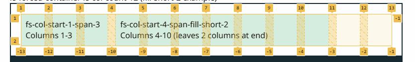
Columns 1-3
Columns 4-10 (leaves 2 columns at end)
<div class="fs-forced-container fs-col-count-12">

    <!-- First block: columns 1-3 -->
    <div class="fs-col-start-1-span-3">
        <div class="block-of-content">
            fs-col-start-1-span-3<br>
            Columns 1-3
        </div>
    </div>

    <!-- Second block: fills from column 4, leaving 2 columns at end -->
    <div class="fs-col-start-4-span-fill-short-2">
        <div class="block-of-content">
            fs-col-start-4-span-fill-short-2<br>
            Columns 4-10 (leaves 2 columns at end)
        </div>
    </div>
</div>
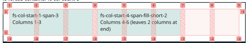
Grid visualization (12-column grid):
Columns 1-3
Columns 4-6 (leaves 2 columns at end)
<div class="fs-forced-container fs-col-count-8">

    <!-- First block: columns 1-3 -->
    <div class="fs-col-start-1-span-3">
        <div class="block-of-content">
            fs-col-start-1-span-3<br>
            Columns 1-3
        </div>
    </div>

    <!-- Second block: fills from column 4, leaving 2 columns at end -->
    <div class="fs-col-start-4-span-fill-short-2">
        <div class="block-of-content">
            fs-col-start-4-span-fill-short-2<br>
            Columns 4-6 (leaves 2 columns at end)
        </div>
    </div>
</div>
Grid visualization (8-column grid):
When to use:
- Use
fs-col-span-{i}when you want an item to span multiple columns starting from its natural position - Use
fs-col-start-{start}-span-{span}when you need to specify both the starting column and span, especially to create gaps between grid items - Use
fs-col-start-{start}-span-fillwhen you want an item to fill from a starting column to the end of the grid without calculating the exact span - Use
fs-col-start-{start}-span-fill-short-{count}when you want to fill from a starting column but leave a specific number of columns empty at the end
Fill-short vs. start-span: Prefer span-fill-short classes when your layout may change column counts (e.g., via responsive breakpoints). With fs-col-start-{start}-span-fill-short-{count}, you only need to change the container's fs-col-count-* class—the item will automatically adapt. With fs-col-start-{start}-span-{span}, changing the column count would require updating the span value on every affected item.
Warning: If the updated column count is less than the total columns that your items span, the grid will auto-add extra columns to accommodate the span. This can produce unexpected layout results.
Control the Gap
Gutters are the negative space, or gaps, between columns and rows. You can control the gutters for the entire grid at once or just for a particular container by using the CSS variables `--fs-gutter-col` and `--fs-spacing-row` which is already setup at the root level.
When you need to control the gap of a particular container you can make a class that has that same CSS Variable name with the new size as seen below.
                        .custom-gap {
                            --fs-spacing-col: 20px;
                            --fs-spacing-row: 5px;
                        }
Be careful when making a large gap, remember that as you increase the gap that means the width of the columns is being reduced. If you compare the width of the fs-1 from above and below you can see that the larger gap being used below made the columns smaller. Additionally, the content in that column is wider than the column which is actually breaking the row.
                            .custom-gap-2 {
                                --fs-spacing-col: 50px;
                                --fs-spacing-row: 5px;
                            }
A possible solution for the issue below could be to add an overflow hidden to the fs-1 but we would recommend instead that you just need that cell to take up more than one column so all the contents can fit.
Also, remember if you use fs-fluid then if the content breaks out of column width it will grow.
                            .custom-gap-2 {
                                --fs-spacing-col: 50px;
                                --fs-spacing-row: 5px;
                            }
Offsets
Offsets work along with the column span class. Allowing you to offset one column by however many columns you need. Just remember the total number of columns your element is spanning and number you are offsetting should not exceed 12. Additionally, you can choose to offset from the left or right or a combination.
fs-offset-right-{Number of Columns to offset by}
fs-offset-left-{breakpoint}-{Number}
fs-offset-right-{breakpoint}-{Number}
fs-2
fs-2
fs-2
fs-2
fs-offset-right-5
fs-4
<!-- Single cell spanning 3 columns, offset left by 9 -->
<div class="fs-container">
    <div class="fs-offset-left-9 fs-3">
        <div class="block-of-content">fs-offset-left-9 fs-3</div>
    </div>
</div>

<!-- Cell offset left by 6 next to non-offset cell -->
<div class="fs-container">
    <div class="fs-offset-left-6 fs-3">
        <div class="block-of-content">fs-offset-left-6 fs-3</div>
    </div>
    <div class="fs-3">
        <div class="block-of-content">fs-3</div>
    </div>
</div>

<!-- Two cells, each offset left by 3 -->
<div class="fs-container">
    <div class="fs-offset-left-3 fs-3">
        <div class="block-of-content">fs-offset-left-3 fs-3</div>
    </div>
    <div class="fs-offset-left-3 fs-3">
        <div class="block-of-content">fs-offset-left-3 fs-3</div>
    </div>
</div>

<!-- Four cells spanning 3 columns, no offsets -->
<div class="fs-container">
    <div class="fs-3">
        <div class="block-of-content">fs-3</div>
    </div>
    <div class="fs-3">
        <div class="block-of-content">fs-3</div>
    </div>
    <div class="fs-3">
        <div class="block-of-content">fs-3</div>
    </div>
    <div class="fs-3">
        <div class="block-of-content">fs-3</div>
    </div>
</div>

<!-- First cell no offset, second cell offset left by 4 -->
<div class="fs-container">
    <div class="fs-4">
        <div class="block-of-content">fs-4</div>
    </div>
    <div class="fs-offset-left-4 fs-4">
        <div class="block-of-content">fs-offset-left-4 fs-4</div>
    </div>
</div>

<!-- Three cells spanning 4 columns, no offsets -->
<div class="fs-container">
    <div class="fs-4">
        <div class="block-of-content">fs-4</div>
    </div>
    <div class="fs-4">
        <div class="block-of-content">fs-4</div>
    </div>
    <div class="fs-4">
        <div class="block-of-content">fs-4</div>
    </div>
</div>

<!-- First offset left 4, middle no offset, last offset left 2 -->
<div class="fs-container">
    <div class="fs-offset-left-4 fs-2">
        <div class="block-of-content">fs-offset-left-4 fs-2</div>
    </div>
    <div class="fs-2">
        <div class="block-of-content">fs-2</div>
    </div>
    <div class="fs-offset-left-2 fs-2">
        <div class="block-of-content">fs-offset-left-2 fs-2</div>
    </div>
</div>

<!-- First offset left 4, others offset left 1 -->
<div class="fs-container">
    <div class="fs-offset-left-4 fs-2">
        <div class="block-of-content">fs-offset-left-4 fs-2</div>
    </div>
    <div class="fs-offset-left-1 fs-2">
        <div class="block-of-content">fs-offset-left-1 fs-2</div>
    </div>
    <div class="fs-offset-left-1 fs-2">
        <div class="block-of-content">fs-offset-left-1 fs-2</div>
    </div>
</div>

<!-- Mixed layout: 2+2+2, then 1+1+1+1, then 2 -->
<div class="fs-container">
    <div class="fs-2">
        <div class="block-of-content">fs-2</div>
    </div>
    <div class="fs-2">
        <div class="block-of-content">fs-2</div>
    </div>
    <div class="fs-2">
        <div class="block-of-content">fs-2</div>
    </div>
    <div class="fs-1">
        <div class="block-of-content">fs-1</div>
    </div>
    <div class="fs-1">
        <div class="block-of-content">fs-1</div>
    </div>
    <div class="fs-1">
        <div class="block-of-content">fs-1</div>
    </div>
    <div class="fs-1">
        <div class="block-of-content">fs-1</div>
    </div>
    <div class="fs-2">
        <div class="block-of-content">fs-2</div>
    </div>
</div>

<!-- Offset left 1 and right 5, next to fs-2 -->
<div class="fs-container">
    <div class="fs-offset-left-1 fs-offset-right-5 fs-4">
        <div class="block-of-content">fs-offset-left-1 fs-offset-right-5 fs-4</div>
    </div>
    <div class="fs-2">
        <div class="block-of-content">fs-2</div>
    </div>
</div>
You can use offsets with breakpoint classes to add spacing that visually matches a design—for example, two equal columns with margins that align to the grid at larger viewports.
<!-- Two columns with offset spacing to match design at large breakpoint -->
<div class="fs-container">
    <div class="fs-offset-left-l-3 fs-l-3">
        <div class="block-of-content">fs-offset-left-l-3 fs-l-3</div>
    </div>
    <div class="fs-offset-right-l-3 fs-l-3">
        <div class="block-of-content">fs-offset-right-l-3 fs-l-3</div>
    </div>
</div>
Reverse Classes
- fs-row-reverse
- fs-col-reverse
- fs-{breakpoint}-row-reverse
- fs-{breakpoint}-col-reverse
Example Text
        <div class="fs-container">

            <!-- Column 1  -->
            <div class="fs-6">
                <div class="block-of-content">fs-6
                    <br> <img src="https://dummyimage.com/210x55?text=img" alt="">
                </div>
            </div>

            <!-- Column 2  -->
            <div class="fs-6">
                <div class="block-of-content">fs-6
                    <br> Example Text
                </div>
            </div>

        </div>
vs.
Example Text
        <div class="fs-container fs-row-reverse">

            <!-- Column 1  -->
            <div class="fs-6">
                <div class="block-of-content">fs-6
                    <br> <img src="https://dummyimage.com/210x55?text=img" alt="">
                </div>
            </div>

            <!-- Column 2  -->
            <div class="fs-6">
                <div class="block-of-content">fs-6
                    <br> Example Text
                </div>
            </div>

        </div>
It works with fs-row as well.
Example Text
        <div class="fs-row fs-row-reverse">

            <!-- Column 1  -->
            <div class="fs-6">
                <div class="block-of-content">fs-6
                    <br> <img src="https://dummyimage.com/210x55?text=img" alt="">
                </div>
            </div>

            <!-- Column 2  -->
            <div class="fs-6">
                <div class="block-of-content">fs-6
                    <br> Example Text
                </div>
            </div>

        </div>
Plus it works with responsive. In this example on mobile the image will always be on top but on larger screens the content and image will alternate.
Example Text
        <div class="fs-container fs-m-row-reverse">

            <!-- Column 1  -->
            <div class="fs-m-6">
                <div class="block-of-content">fs-6
                    <br> <img src="https://dummyimage.com/210x55?text=img" alt="">
                </div>
            </div>

            <!-- Column 2  -->
            <div class="fs-m-6">
                <div class="block-of-content">fs-m-6
                    <br> Example Text
                </div>
            </div>

        </div>
- fs-first-in-row
- fs-first-in-col
- fs-{breakpoint}-first-in-row
- fs-{breakpoint}-first-in-col
<div class="fs-forced-container fs-col-count-1 fs-col-count-m-2">
    <div class="">
        <div class="block-of-content">
            <img src="https://dummyimage.com/210x55?text=img" alt="">
        </div>
    </div>
    <div class="">
        <div class="block-of-content">
            Example Text
        </div>
    </div>
</div>
vs.
Example Text
<div class="fs-forced-container fs-col-count-1 fs-col-count-m-2">
    <div class="">
        <div class="block-of-content">
            <img src="https://dummyimage.com/210x55?text=img" alt="">
        </div>
    </div>
    <div class="fs-m-first-in-row">
        <div class="block-of-content">fs-m-first-in-row<br>
            Example Text
        </div>
    </div>
</div>
Grid Alignment
When utilizing the grid system, you have the ability to align columns based off their horizontal or vertical to leverage layouts to your liking.
Main-Axis Alignment: Use justify-content classes to align items along the main-axis (horizontal in row layouts) within a flex container. Note: These classes work with fs-container (flexbox).
        <div class="fs-container fs-start">

            <!-- Column 1 -->
            <div class="fs-m-3">
                <div class="block-of-content">fs-m-3</div>
            </div>

            <!-- Column 2  -->
            <div class="fs-m-3">
                <div class="block-of-content">fs-m-3</div>
            </div>

            <!-- Column 3  -->
            <div class="fs-m-3">
                <div class="block-of-content">fs-m-3</div>
            </div>

        </div>
        <div class="fs-container fs-center">

            <!-- Column 1 -->
            <div class="fs-m-3">
                <div class="block-of-content">fs-m-3</div>
            </div>

            <!-- Column 2  -->
            <div class="fs-m-3">
                <div class="block-of-content">fs-m-3</div>
            </div>

            <!-- Column 3  -->
            <div class="fs-m-3">
                <div class="block-of-content">fs-m-3</div>
            </div>

        </div>
        <div class="fs-container fs-end">

            <!-- Column 1 -->
            <div class="fs-m-3">
                <div class="block-of-content">fs-m-3</div>
            </div>

            <!-- Column 2  -->
            <div class="fs-m-3">
                <div class="block-of-content">fs-m-3</div>
            </div>

            <!-- Column 3  -->
            <div class="fs-m-3">
                <div class="block-of-content">fs-m-3</div>
            </div>

        </div>
        <div class="fs-container fs-around">

            <!-- Column 1 -->
            <div class="fs-m-3">
                <div class="block-of-content">fs-m-3</div>
            </div>

            <!-- Column 2  -->
            <div class="fs-m-3">
                <div class="block-of-content">fs-m-3</div>
            </div>

            <!-- Column 3  -->
            <div class="fs-m-3">
                <div class="block-of-content">fs-m-3</div>
            </div>

        </div>
        <div class="fs-container fs-between">

            <!-- Column 1 -->
            <div class="fs-m-3">
                <div class="block-of-content">fs-m-3</div>
            </div>

            <!-- Column 2  -->
            <div class="fs-m-3">
                <div class="block-of-content">fs-m-3</div>
            </div>

            <!-- Column 3  -->
            <div class="fs-m-3">
                <div class="block-of-content">fs-m-3</div>
            </div>

        </div>
Cross-Axis Alignment: Use align-items classes to align items along the cross-axis (vertical in row layouts) within a flex container. Note: These classes work with fs-container (flexbox). align-items also works in CSS Grid, but these utility classes are designed for flexbox contexts.
Example Text
        <div class="fs-container fs-top">

            <!-- Column 1  -->
            <div class="fs-m-6">
                <div class="block-of-content">fs-m-6
                    <br> <img src="https://dummyimage.com/210x55?text=img" alt="">
                </div>
            </div>

            <!-- Column 2  -->
            <div class="fs-m-6">
                <div class="block-of-content">fs-m-6
                    <br> Example Text
                </div>
            </div>

        </div>
Example Text
        <div class="fs-container fs-middle">

            <!-- Column 1  -->
            <div class="fs-m-6">
                <div class="block-of-content">fs-m-6
                    <br> <img src="https://dummyimage.com/210x55?text=img" alt="">
                </div>
            </div>

            <!-- Column 2  -->
            <div class="fs-m-6">
                <div class="block-of-content">fs-m-6
                    <br> Example Text
                </div>
            </div>

        </div>
Example Text
        <div class="fs-container fs-bottom">

            <!-- Column 1  -->
            <div class="fs-m-6">
                <div class="block-of-content">fs-m-6
                    <br> <img src="https://dummyimage.com/210x55?text=img" alt="">
                </div>
            </div>

            <!-- Column 2  -->
            <div class="fs-m-6">
                <div class="block-of-content">fs-m-6
                    <br> Example Text
                </div>
            </div>

        </div>
Individual Item Alignment: To align individual items independently along the cross-axis, add a class to the specific element. Note: align-self works in both flexbox (fs-container) and CSS Grid (fs-forced-container).
Example Text
Example Text
        <div class="fs-container">

            <!-- Column 1  -->
            <div class="fs-m-4">
                <div class="block-of-content">
                    <img src="https://dummyimage.com/210x55?text=img" alt="">
                    <br>Example Text
                </div>
            </div>

            <!-- Column 2  -->
            <div class="fs-m-4 fs-self-top">
                <div class="block-of-content">fs-self-top</div>
            </div>

            <!-- Column 3  -->
            <div class="fs-m-4">
                <div class="block-of-content">
                    <img src="https://dummyimage.com/210x55?text=img" alt="">
                    <br>Example Text
                </div>
            </div>

        </div>
Example Text
Example Text
        <div class="fs-container">

            <!-- Column 1  -->
            <div class="fs-m-4">
                <div class="block-of-content">
                    <img src="https://dummyimage.com/210x55?text=img" alt="">
                    <br>Example Text
                </div>
            </div>

            <!-- Column 2  -->
            <div class="fs-m-4 fs-self-middle">
                <div class="block-of-content">fs-self-middle</div>
            </div>

            <!-- Column 3  -->
            <div class="fs-m-4">
                <div class="block-of-content">
                    <img src="https://dummyimage.com/210x55?text=img" alt="">
                    <br>Example Text
                </div>
            </div>

        </div>
Example Text
Example Text
        <div class="fs-container">

            <!-- Column 1  -->
            <div class="fs-m-4">
                <div class="block-of-content">
                    <img src="https://dummyimage.com/210x55?text=img" alt="">
                    <br>Example Text
                </div>
            </div>

            <!-- Column 2  -->
            <div class="fs-m-4 fs-self-bottom">
                <div class="block-of-content">fs-self-bottom</div>
            </div>

            <!-- Column 3  -->
            <div class="fs-m-4">
                <div class="block-of-content">
                    <img src="https://dummyimage.com/210x55?text=img" alt="">
                    <br>Example Text
                </div>
            </div>

        </div>
CSS Grid Container Inline-Axis Alignment: Use fs-col-justify-* classes on the grid container to align all grid items along the inline-axis (horizontally) within their grid cells. Note: These classes only work in CSS Grid contexts (when using fs-forced-container). This sets the default alignment for all items in the grid, which can be overridden by individual items using fs-col-self-* classes.
(default behavior)
        <div class="fs-forced-container fs-col-count-3 fs-col-justify-stretch">

            <!-- Grid item 1 -->
            <div class="">
                <div class="block-of-content">fs-col-justify-stretch<br> (default behavior)</div>
            </div>

            <!-- Grid item 2 -->
            <div class="">
                <div class="block-of-content">All items stretch</div>
            </div>

            <!-- Grid item 3 -->
            <div class="">
                <div class="block-of-content">To fill cells</div>
            </div>

        </div>
        <div class="fs-forced-container fs-col-count-3 fs-col-justify-center">

            <!-- Grid item 1 -->
            <div class="">
                <div class="block-of-content">fs-col-justify-center</div>
            </div>

            <!-- Grid item 2 -->
            <div class="">
                <div class="block-of-content">All items centered</div>
            </div>

            <!-- Grid item 3 -->
            <div class="">
                <div class="block-of-content">Horizontally</div>
            </div>

        </div>
        <div class="fs-forced-container fs-col-count-3 fs-col-justify-start">

            <!-- Grid item 1 -->
            <div class="">
                <div class="block-of-content">fs-col-justify-start</div>
            </div>

            <!-- Grid item 2 -->
            <div class="">
                <div class="block-of-content">All items aligned</div>
            </div>

            <!-- Grid item 3 -->
            <div class="">
                <div class="block-of-content">To start</div>
            </div>

        </div>
        <div class="fs-forced-container fs-col-count-3 fs-col-justify-end">

            <!-- Grid item 1 -->
            <div class="">
                <div class="block-of-content">fs-col-justify-end</div>
            </div>

            <!-- Grid item 2 -->
            <div class="">
                <div class="block-of-content">All items aligned</div>
            </div>

            <!-- Grid item 3 -->
            <div class="">
                <div class="block-of-content">To end</div>
            </div>

        </div>
        <div class="fs-forced-container fs-col-count-3 fs-col-justify-normal">

            <!-- Grid item 1 -->
            <div class="">
                <div class="block-of-content">fs-col-justify-normal</div>
            </div>

            <!-- Grid item 2 -->
            <div class="">
                <div class="block-of-content">Uses default</div>
            </div>

            <!-- Grid item 3 -->
            <div class="">
                <div class="block-of-content">Grid behavior</div>
            </div>

        </div>
Available Classes:
fs-col-justify-stretch- Stretch all items to fill their grid cells (default)fs-col-justify-center- Center all items within their grid cellsfs-col-justify-start- Align all items to the start of their grid cellsfs-col-justify-end- Align all items to the end of their grid cellsfs-col-justify-normal- Use the default grid behavior
Responsive Breakpoints: All justify-items classes are available with breakpoint prefixes:
- fs-col-justify-{breakpoint}-stretch
- fs-col-justify-{breakpoint}-center
- fs-col-justify-{breakpoint}-start
- fs-col-justify-{breakpoint}-end
- fs-col-justify-{breakpoint}-normal
Example: fs-col-justify-m-center, fs-col-justify-l-start, etc.
Important: These classes only work in CSS Grid contexts (when using fs-forced-container). They set the default alignment for all grid items, which can be overridden by individual items using fs-col-self-* classes.
CSS Grid Inline-Axis Alignment: Use fs-col-self-* classes to align individual grid items along the inline-axis (horizontally) within their grid cell. Note: These classes only work in CSS Grid contexts (when using fs-forced-container). Unlike align-self which works in both flexbox and grid, justify-self is CSS Grid only.
(default behavior)
        <div class="fs-forced-container fs-col-count-3">

            <!-- Grid item 1 -->
            <div class="fs-col-self-stretch">
                <div class="block-of-content">fs-col-self-stretch<br> (default behavior)</div>
            </div>

            <!-- Grid item 2 -->
            <div class="fs-col-self-center">
                <div class="block-of-content">fs-col-self-center</div>
            </div>

            <!-- Grid item 3 -->
            <div class="fs-col-self-start">
                <div class="block-of-content">fs-col-self-start</div>
            </div>

        </div>
        <div class="fs-forced-container fs-col-count-3">

            <!-- Grid item 1 -->
            <div class="fs-col-self-start">
                <div class="block-of-content">fs-col-self-start</div>
            </div>

            <!-- Grid item 2 -->
            <div class="fs-col-self-center">
                <div class="block-of-content">fs-col-self-center</div>
            </div>

            <!-- Grid item 3 -->
            <div class="fs-col-self-end">
                <div class="block-of-content">fs-col-self-end</div>
            </div>

        </div>
        <div class="fs-forced-container fs-col-count-3">

            <!-- Grid item 1 -->
            <div class="fs-col-self-start">
                <div class="block-of-content">fs-col-self-start</div>
            </div>

            <!-- Grid item 2 -->
            <div class="fs-col-self-stretch">
                <div class="block-of-content">fs-col-self-stretch</div>
            </div>

            <!-- Grid item 3 -->
            <div class="fs-col-self-start">
                <div class="block-of-content">fs-col-self-start</div>
            </div>

        </div>
        <div class="fs-forced-container fs-col-count-3">

            <!-- Grid item 1 -->
            <div class="fs-col-self-end">
                <div class="block-of-content">fs-col-self-end</div>
            </div>

            <!-- Grid item 2 -->
            <div class="fs-col-self-stretch">
                <div class="block-of-content">fs-col-self-stretch</div>
            </div>

            <!-- Grid item 3 -->
            <div class="fs-col-self-end">
                <div class="block-of-content">fs-col-self-end</div>
            </div>

        </div>
        <div class="fs-forced-container fs-col-count-3">

            <!-- Grid item 1 -->
            <div class="fs-col-self-normal">
                <div class="block-of-content">fs-col-self-normal</div>
            </div>

            <!-- Grid item 2 -->
            <div class="fs-col-self-stretch">
                <div class="block-of-content">fs-col-self-stretch</div>
            </div>

            <!-- Grid item 3 -->
            <div class="fs-col-self-normal">
                <div class="block-of-content">fs-col-self-normal</div>
            </div>

        </div>
Available Classes:
fs-col-self-stretch- Stretch to fill the grid cell (default)fs-col-self-center- Center within the grid cellfs-col-self-start- Align to the start of the grid cellfs-col-self-end- Align to the end of the grid cellfs-col-self-normal- Use the grid container'sjustify-itemsvalue
Responsive Breakpoints: All justify-self classes are available with breakpoint prefixes:
- fs-col-self-{breakpoint}-stretch
- fs-col-self-{breakpoint}-center
- fs-col-self-{breakpoint}-start
- fs-col-self-{breakpoint}-end
- fs-col-self-{breakpoint}-normal
Example: fs-col-self-m-center, fs-col-self-l-start, etc.
Important: These classes only work in CSS Grid contexts (when using fs-forced-container). They have no effect in flexbox containers.
Multi-line Alignment: Use align-content classes to align flex lines within a flex container when there is extra space in the cross-axis. This is useful when you have multiple rows of flex items. Note: align-content works in both flexbox and CSS Grid, but these utility classes are primarily designed for flexbox contexts.
Row 1
Row 1
Row 2
Row 2
        <div class="fs-container fs-content-top">

            <!-- Row 1 -->
            <div class="fs-m-6">
                <div class="block-of-content">fs-m-6<br> Row 1</div>
            </div>
            <div class="fs-m-6">
                <div class="block-of-content">fs-m-6<br> Row 1</div>
            </div>

            <!-- Row 2 -->
            <div class="fs-m-6">
                <div class="block-of-content">fs-m-6<br> Row 2</div>
            </div>
            <div class="fs-m-6">
                <div class="block-of-content">fs-m-6<br> Row 2</div>
            </div>

        </div>
Row 1
Row 1
Row 2
Row 2
        <div class="fs-container fs-content-middle">

            <!-- Row 1 -->
            <div class="fs-m-6">
                <div class="block-of-content">fs-m-6<br> Row 1</div>
            </div>
            <div class="fs-m-6">
                <div class="block-of-content">fs-m-6<br> Row 1</div>
            </div>

            <!-- Row 2 -->
            <div class="fs-m-6">
                <div class="block-of-content">fs-m-6<br> Row 2</div>
            </div>
            <div class="fs-m-6">
                <div class="block-of-content">fs-m-6<br> Row 2</div>
            </div>

        </div>
Row 1
Row 1
Row 2
Row 2
        <div class="fs-container fs-content-stretch">

            <!-- Row 1 -->
            <div class="fs-m-6">
                <div class="block-of-content">fs-m-6<br> Row 1</div>
            </div>
            <div class="fs-m-6">
                <div class="block-of-content">fs-m-6<br> Row 1</div>
            </div>

            <!-- Row 2 -->
            <div class="fs-m-6">
                <div class="block-of-content">fs-m-6<br> Row 2</div>
            </div>
            <div class="fs-m-6">
                <div class="block-of-content">fs-m-6<br> Row 2</div>
            </div>

        </div>
Row 1
Row 1
Row 2
Row 2
        <div class="fs-container fs-content-bottom">

            <!-- Row 1 -->
            <div class="fs-m-6">
                <div class="block-of-content">fs-m-6<br> Row 1</div>
            </div>
            <div class="fs-m-6">
                <div class="block-of-content">fs-m-6<br> Row 1</div>
            </div>

            <!-- Row 2 -->
            <div class="fs-m-6">
                <div class="block-of-content">fs-m-6<br> Row 2</div>
            </div>
            <div class="fs-m-6">
                <div class="block-of-content">fs-m-6<br> Row 2</div>
            </div>

        </div>
Responsive Breakpoints: All align-content classes are available with breakpoint prefixes:
- fs-content-{breakpoint}-top
- fs-content-{breakpoint}-middle
- fs-content-{breakpoint}-stretch
- fs-content-{breakpoint}-bottom
Example: fs-content-m-top, fs-content-l-middle, etc.
Mixins Reference
The following SCSS includes are detailed explanations of the mixins used to create the Flexspan Grid System. Feel free to create your own classes using these or go as far as creating your own grid system!
@include flex-parent() Arguments consist of ($display: flex, $flex‑direction: null, $flex‑wrap: null, $justify‑content: null, $align‑items: null, $align‑content: null)
Note: flex-parent always applies gap: var(--fs-spacing-row) var(--fs-spacing-col) and box-sizing: border-box.
| Arguments | Default value | Values | Description |
|---|---|---|---|
| $display | flex | flex | inline-flex | generate a block-level or an inline-level grid container |
| $flex-direction | null | null | row | row-reverse | column | column-reverse | define the main axis and the direction |
| $flex-wrap | null | null | nowrap | wrap | wrap-reverse | whether flex items are forced into a single line or can be wrapped onto multiple lines |
| $justify-content | null | null | flex-start | flex-end | center | space-between | space-around | space-evenly | defines space between and around content items along the main-axis of container |
| $align-items | null | null | flex-start | flex-end | center | baseline | stretch | defines space between and around flex items along the cross-axis of container |
| $align-content | null | null | flex-start | flex-end | center | space-between | space-around | stretch | defines space between and around content items along the cross-axis of their container |
@include flex-item() Arguments consist of ($col: initial, $grid‑columns: 12, $col‑offset: null, $offset‑direction: left, $use‑flex: true, $align‑self: null, $flex‑grow: 0, $flex‑shrink: 1, $flex‑basis: null, $order: null, $shorthand: true, $width: null, $max-width: null, $min‑width: null, $height: null, $max‑height: null, $min‑height: null)
| Arguments | Default value | Values | Description |
|---|---|---|---|
| $col | initial | initial | <number> | auto | equal | none | positive | <number> Unitless: defines the number of columns this cell spans (flex-shrink: 0, flex-basis calculated from columns and gap). With unit (e.g. 50px): used directly as flex-basis.initial results in flex: 0 1 auto;auto results in flex: 1 1 auto;equal results in flex: 1 1 0;none results in flex: 0 0 auto;positive results in flex-grow defined by $flex-grow unless it is zero it will be forced to be flex-grow: 1; and flex-shrink and flex-basis are both set to 0 |
| $grid-columns | 12 | <number> | define the total number of columns in the grid, this number will be used to calculate the flex basis. |
| $col-offset | null | null | <percentage> | <unitless number> | <percentage> offset by percentage. <unitless number> offset by that many columns (calculated with gap). |
| $offset-direction | left | left | right | will determine if the offset is on the left or right of the item. |
| $use-flex | true | true | false | <boolean> determines if display flex styles are added |
| $align-self | null | null | auto | flex-start | flex-end | center | baseline | stretch | override the align-items value |
| $flex-grow | 0 | <number> | grow relative to the rest of items in the grid. specifies what amount of space inside the flex container the item should take up. |
| $flex-shrink | 1 | <number> | shrink relative to the rest of items in the grid |
| $flex-basis | null | null | <length> | auto | specifies the initial main size of an item |
| $order | null | null | <integer> | specifies the order in the grid container |
| $shorthand | true | true | false | use flex property as shorthand by default. use three properties flex-basis, flex-grow and flex-shrink if false. |
| $width | null | null | <boolean> | <width> | auto | specifies the width of an element |
| $max-width | null | null | <boolean> | <width> | auto | sets the maximum width of an element |
| $min-width | null | null | <boolean> | <width> | auto | sets the minimum width of an element |
| $height | null | null | <height> | specifies the height of an element |
| $max-height | null | null | <height> | sets the maximum height of an element |
| $min-height | null | null | <height> | sets the minimum height of an element |
Where did the name come from?
My coworkers originally kept adding a form of my name to it calling it FlexBrox which I was flattered by however, I wanted a naming convention that made sense. I am a bit old school and used to working in tables both for early web development and in HTML emails. When I try to explain other grid systems I realized that classes like "col-1" does not mean one column it means it spans across one column in your grid. Which is similar to the colspan attribute you find on tables in HTML. Since we are using flexbox as our base I combine them to be Flexspan.